Sunday, November 22, 2009

Objectified


If you haven't already seen 'Objectified', go now and watch it. The movie focuses on designers and their impact on out society--however subtle it is. They interview a few prominent designers and delve into their design process and how they perceive what design is. If you are a designer, this is great insight into the minds of great designers.

Head over to: Objectified
Image courtesy of Objectifiedfilm.com

A Niche of Davis


Finally having sometime to take in the City of Davis, I've realized that there is a growing number of longboarders on the UC Campus. This came as somewhat of a surprise, as the majority of college students where I came from did not. But I suppose this is all besides the point of this blog.

As a designer, I'm always itching to make something, it doesn't matter what. Not to long ago a buddy of mine and I decided to start making longboards. Both independently scheming and then finally stumbling upon our common interests. We set out to make the press for the boards and bought all the materials. And so began our journey into the art of making longboards.

To date I, personally, have made more that a dozen or so boards and documented most of them. The fact of the matter is that, when the operation gets up and going it is cheaper to make your own boards than buy the mass produced ones. Albeit you do have to spend time designing how the board responds but, that is all part of the creation process and the 'bonding' of the object and its owner.

I will have a website up shortly with a catalog of my boards and t-shirts hopefully by the start of the new year. Be sure the check it out if you happen to still read this blog.


Thursday, November 19, 2009

Sustainable Design

On November 18th, 2009, Nathan Shedroff came to speak about 'sustainable design'. He led with Design being the problem in sustainable design, because naturally, as designers we create for the future. We create that desire to have something new, with new features and styling. Thus this creates a huge waste problem, and we are unable as a nation, and society to responsibly get rid of this 'out-dated' equipment.

As an emerging artist/designer, this is a major concern to me, and from what I hear a lot of other designers. Our job as the next generation of designers is to take into account the fickle society we live in. When things become useless we discard fervently, just as when something we perceive as new and 'in' we feverishly try to buy it.

In our industrialized nation there are no more connections between objects and owners. I think this will be a step towards a more sustainable society--bringing the connection with an object and its owner back.

Head over to: Nathan's World for more information!

Designing on a budget

As a college student, I think one part of being a student is being broke--or close to it. This is, however, a good thing at times and a bad thing at other times. When I finally transfered to the University, I was confronted with the dilemma of living with a roommate and having half the living space. I knew I would need a desk, a bed, closet space and just room to move around. The entire room was around 14.5' x 11', my roommate had already moved in and took most of the space with his desk and bed. Long story shot, I got the shaft.

So to recap, we both had full-size bed (approx 6' x 4.5' times 2) and one desk. Thats already 54 sq ft. taken of 159.5 sq ft. that leaves 105.5 sq ft. for two desks and room to navigate around. In a moment of clarity, I began drawing plans up for a full-size loft. Generally, lofts made by major manufactures run upwards of $400.00USD to $500.00USD, without the ability to personalize it. All in all when the project was completed it cost me around $150.00 to $200.00USD. Not to mention that the loft was build by me, for me, but I was able to add things to accommodate my situation.

I should have an instructable up with in the week, but the process is rather simple and straight forward. This was a fun project and learning experience. Not to mention that I am benefiting from building for my own needs, I used most of the scraps for miscellaneous parts, like the ladder. I'll update this when the instructable is up. For now enjoy a few photos, and if you want, try it out for yourself by heading to instructables to get an idea of how to start designing basic furniture on the cheap!


Wednesday, November 18, 2009

The EyeWriter

While, browsing a website I frequent, I came upon the "eyeWriter". This device enables paraplegic people to 'draw' or 'design' with just they eye. The amazing device can be made under $50.00USD and paired with open-source software (free, but contributions welcomed). This tool was brought to reality by a group of people, mostly graffiti artists:

TemptOne
Graffiti Research Lab
openFrameworks
The Ebeling Group
FAT Lab
Zach Lieberman
James Powderly
Evan Roth
Chris Sugrue
Theo Watson
Keith Pasko
LM4K
Eleanor Dunk
Jamie Wilkinson
Greg Leuch


The program isn't a pixel based drawing software, like Photoshop or The Gimp, but rather a vector based--or something like that--software, like Illustrator or Inkscape.

The EyeWriter is allowing artists who have thought they lost the ability to create with normal means, by utilizing an ir (infra-red) led and a PS3 EyeToy and a few miscellaneous items. It would seem as though the difficulty in constructing a pair isn't hard either, basic soldering skills are needed at most.

Check out: The EyeWriter

and this video of it in action:


Vibrating boundaries


Josef Albers discusses the Interaction of Color and how it is perceived by humans. His book utilizes paper diagrams to help emphasize theory. The basic theory of 'Vibrating Boundaries' is when complementary colors are placed on top of each other they tend to 'vibrate'. This is because the colors help emphasize each other.

As you can see by the example to the right, the cyan text and the objects seem as though they are popping out of the red field.

This theory can be used in a quick design where attention is needed to be drawn. The harshness of complementary colors applied on top of each other naturally draws the eye to it. However, as a designer we must be aware of this and avoid it as it is not necessarily the best tool to gain attention.

Sunday, November 1, 2009

Escher


M.C. Escher

We have all seen the works of M.C. Escher. Whether it be in a classroom or a book, you have to appreciate the ability for Escher to play with the figure/ground to create shapes and images. The seemingly unstable image should been seen as a bistable image, that can reflect both a set of black birds and a set of white birds.

Escher has an ability for creating illusions of space. Are the birds black or are they white? A seemingly novel trick, this ability is useful for many graphic artist and designers today. Understanding the properties of Gestalt, is like learning to use your hands to draw.

Even if you did not understand the properties of Gestalt, you probably know them without even knowing it. We use them everyday as designers and artists.


Image courtesy of http://www.clas.ufl.edu/ipsa/journal/2000_tsur03.shtml

Simple Designs


1" Grid Design.

As a designer, there are basic projects we all must do. This 1"grid design was one of those I had to do. Initially the design was in black and white, but for another project I added the color. Here there is a great deal of rhythm, pattern, shape and line. The smaller shapes unify to create bigger shapes. There seems to be an unstable relationship with the colors and shapes. The purple seems to come forward in the mush of red and yellow, but at the same time the red and yellow are fighting to come to the foreground. There is even a sense of good continuation with some of the sphere shapes.


Even with the simplest of projects, the outcome can be very complex.

Annie's Blue Jeans


Annie's Blue Jeans

79" x 82"

Made from Annie Ruth Collin's old blue jeans tapestry fabric, cotton fabric, cotton velvet, hand dyed wide-wale cotton corduroy, cotton batting and muslin.

Hand quilted by Mensie Pettway of Gee Bend Alabama.

Looking at 'Annie's Blue Jeans' quilt, the usage of line, shape, value, and some rhythm are apparent. Initially, the inner square holds a sense of balance and scale. Each square within this inner square is a solid color which makes it stand out from the shades of blue. The inner square becomes a sort of focal point for the viewer.

Pettway makes good use of line and repetition. There is some rhythm to the entire peace, as each 'ring' of the quilt flows from one to the other, there are no abrupt stops. Shades of blue leading to the climax, the inner square.

The texture reflects the materials used--Blue Jeans.

Pettway takes an age old tradition of quilt making, and brings it back to its roots in a time where quilts are typically made from bought fabrics, not old unused clothing, fabric and other things.

If you would like to see the full gallery of quilt collections, and you are in the Davis, CA area, head over to the Nelson Art Gallery located in UC Davis.


Monday, October 26, 2009

Yeoman Organics

Today I will be featuring an organic T-shirt company with roots in the Davis community and the Bay area. The owner, Joe, started the company in 2008 with two other individuals, Phil and Levy. Yeoman Organics is commited to 'clean design' and 'bridging the gap between design and organics'.

They utilise clean, or green, techniques of printmaking and organic cotton shirts. This helps the local cotton farmers, and helps to reduce 1/3 pounds of pesticides per shirt.

For more information check out:
www.yeomanorganics.com

Yeoman Organics on Facebook

Sunday, October 25, 2009

'Love Makes Many...' by Neochron


Love makes many things seem insignificant is an amazing piece of typography. Neochron, of the DevianArt community, makes good use of negative positive space with the lettering as well as the silhouetted figures and structures that are scattered within the main body of text.

The main text is well balanced with negative and positive space. The cityscape and bridge offset the floral design at the top of the text. The figure cutting into the 'M' appears to be coming from behind the 'A', creating a focal point, as, I suppose, most people associate love with another human being.

The emphasis on 'Love Makes Many' helps to convey the message 'Love makes many things seem insignificant'. Add to this, the 'things seem insignificant' is comparably smaller in size also helps to convey the message behind this poster.

The usage of familiar symbols help the reader or viewer to relate to the poster. The heart symbol, and even the color red we associate with love and romance. Also, the red/black color scheme is a classic color scheme that always goes well together.

All together, this typography piece is well done and well thought out. It get its message accross in a somewhat 'cute' and 'playful' way.

Image courtesy of Neochron at DeviantArt.com

Designing for the 21st century


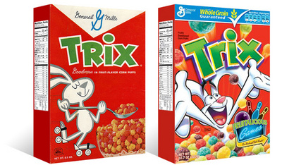
As the post-modern fever begins to quiet in America, designers are seeming to look back at quieter, more restrained design. For this blog we will look at the redesign of the trix cereal box.

On the left is the current design [D1] of Trix cereal, a throwback to a simpler time. And on the left the second most recent design [D2] of Trix cereal.

Looking at the D2 design, there is less unity with the entire box and more emphasis on the brand 'Trix'. The pieces are all seemingly disparate, only unified by the usage of similar colors.The illustration is loud, and unrestrained, typical of post-modern design--lots of noise, loud, and a disregard to traditional design standards.

Now looking at the D1 design, the box is unified as a whole, the panels flow from one to another without a 'pause' in its reading. The emphasis is now the whole of the box rather than the brand. The design is much quieter and easier to read.

Hopefully with this new sense of design, there will be less bad design and more great design.

Thanks to TheDieline.com for the image.

Wednesday, October 14, 2009

The Design Process [as I learned it

Whether we like it or not everything around us was created or designed by someone. The keyboard I am typing on, the screen you are reading this on and even the mouse pad (if you have one) was designed by someone trying to solve a problem—combining functionality with aesthetics.

Generally, that is how design begins; finding a solution to a problem. Once the problem has been identified, research is done, if commissioned by a client then identifying their goals, budget and so on. Next the 'Ideation' stage or prelim sketches are created by using the information gathered in the research stage. When these are completed review and critique of the sketches are done and revised with the feedback receive. Generally, one should take a rest between this period and the next as to rest one's eyes and possibly bring fresh ideas to the table.

The next two steps in the design process are the comprehensives and implementation of the final copy. The comprehensive stage is similar to the prelim sketches, but in this stage sketches are enlarged to print size and critiqued. With the new data, we move to the final stage of production.

This is the ideal process of design, generally, the real world will have a more circular process as apposed to the linear process above. In the circular model, there are still seven stages but an anyone point, one may have to restart at research or prelim sketches. This is sounds more reasonable as there will be constant input from clients and even one's own self.

All of this is to ensure that the final product is, in fact, functional while still holding aesthetic values [either for the client or the designer]. Critique only serves to better designers' ability to do so.

Inspiration from outside

Artists, Designers and the like are all inspired or moved by some ideal to create. But what happens when one has an off day, week, month, or even a year? If you're like me, or any graphic artist, you can't have any off days as income is tied directly to your ability to create.

Artists like Doze Green look to music as a form creative inspiration. The music speaks to him and he translates the beats with his paint brush. Not only does he use music as inspiration, he looks back to his cultural roots for symbols and styles to create.

Even type can inspire a generation of graphic artists. Referring to my previous blog, the font 'Helvetica' created an entire counter-culture to the modernist movement. David Carson, a graphic artist, was one such post-modernist battling the conformity of the modernists. Using free form text, and unconventional fonts to create works that both went against the grain and diverged to help create the grunge movement of the 90's

A great resource for inspiration is http://mashable.com/2009/03/16/design-inspiration/. They have a handfull of website, galleries, and portfolios the look through for inspiration from other artists. Even if you think the life of an artist is a solitude one, your ability can only go so far without learning from others.

Again, check out:

www.dozegreen.com

and

The DVD 'Helvetica'

Helvetica

Since its inception into the designer's toolbox, it has grown to rockstar status. The font is used in almost everything we see today. The U.S. Government uses it on its tax forms, the EPA uses it, signs littering the streets use it, we see it everywhere we go. But how did Helvetica get ingrained into modern society around the world?

According to Hermann Zapf, the font Helvetica became popular with designers because the postwar attitude of idealism and social responsibility. It was just what designers were looking for, something that played with the figure ground relationship that made it functional.

Now almost 60 years since its creation, Helvetica still has a strong group of followers. Notably, Massimo Vignelli who sums up Helvetica as modern type, invented for modern times. And Manuel Krebs, who summed up Helvetica as its own design system. One designs around the type itself, even the layperson can design something just putting Helvetica in bold and typing something.

There hasn't, or at least seemingly hasn't, been a font with so much impact on society in the past 60 years like Helvetica. You can look at Arial and it's simply an adjusted version on Helvetica. The street signs are set to Helvetica. It has become standard, default, it has be come air.

For more on 'Helvetica' check out the DVD “Helvetica”


Monday, October 12, 2009

What is Design? A subjective look at what Design is to me.

So what exactly is 'Design'? The Greeks defined it as a work in progress, the Latin defined it as mark making [as well as the Italian]. Some say it is applied art, while others say it is not art. Well, in this article I will, or at least try to, define what 'Design' is to me.

The reason I chose to study design and art was because the process of making art or designing something is at times very personal. To me design is a way of life, a way of thinking, a journey. Design isn't merely a way to communicate, but rather a field of study which incorporates many other disciplines such as, history, philosophy, mythology, sociology and the like. Looking back at older civilizations, the Chinese blended philosophical text, understanding of law, and aesthetics into a group we now call the scholar-official. For a time China blended the arts, government, and life to create a prosperous society.

Design flows through everyday life, the computer I am writing on was design to be aesthetically please yet functional. Similarly, I make longboards in this same fashion. Using animal forms to create the board, while, still making the board rideable.

So what is design to me? Design is life, a study of everything [or almost everything].

Love what you do, do what you love.

Sunday, October 11, 2009

From the turntables...

In the early 70's a new beat emerged from the East Coast of America. Pioneered by people like Grandmaster Flash, and Herbie Hancock, turntablism emrgered. Through the years of its experimentation, it has gathered a large group of followers--with turntables selling more than guitars. With this new creative outlet arose Doze Green, a graffiti artist. While the Dj's spun their records, scratching, mixing and cutting breaks, Green interpreted the beats.

In the world of Dj'ing, many see it as a form of communication between other Dj's and even to other worlds. But to Green the beats were stroke of the paint brush. An original member of the Rock Steady Crew Green was a part of a bigger whole.

From the translation of the Latin 'designare' to mark, Green follows a millennia of artists trying to communicate through brush strokes. Initially, Green started on walls and trains, eventually moving to more traditional formats. But still, his intent remained to communicate.

Green helped to create a new culture within America's rising minority class. His work inspires many young and aspiring graffiti artists as well as traditional artists.

As for my own personal reaction to his work. I feel that it is awe inspiring and his ability to communicate through only his brush strokes and paint is amazing. While he may have had a message in mind when he created the work, in the end it is up to each of us to interpret what he was trying to communicate.

Head to www.dozegreen.com for more information on Doze.

Sunday, October 4, 2009

Typographic Exploration in Hangul


Today marks the opening day of Hyunju Lee and Phil Choo's typographic design exhibit at the University of California, Davis. Running from October 4th through December 6th, 2009, the exhibition, explores the usage of Hangul [Korean writing system] as a art form in contrast to its more traditional artistic form--calligraphy.

The nature of using text as the basis of art or design isn't new, but rather quite old. Most every modern civilization has roots tied to calligraphy, for example the Chinese with their writing system or the Arabs with theirs' as well. Hyunju and Phil apply their traditional roots to a new era of design and art. This was reflected in the way the artists chose to exhibit their work.

Some pieces were setup to emulate traditional Asian type scroll calligraphy, but had a modern twist to it. The manipulation of Hangul in ways like color, placement, orientation and size. A piece by Lee, I believe it was called "ha ha," had the Hangul character for the sound "Ha" repeated throughout the format, but had three in a up, down, up pattern bold. Possibly to try and communicate how universal laughter is, and how it takes us to a "higher" state of mind.

Aside from this the entire exhibit was very interesting and for me personally, it gave me a lot of inspiration for typography.


Photo Courtesy of www.designmuseum.ucdavis.edu