Today I will be featuring an organic T-shirt company with roots in the Davis community and the Bay area. The owner, Joe, started the company in 2008 with two other individuals, Phil and Levy. Yeoman Organics is commited to 'clean design' and 'bridging the gap between design and organics'.
They utilise clean, or green, techniques of printmaking and organic cotton shirts. This helps the local cotton farmers, and helps to reduce 1/3 pounds of pesticides per shirt.
For more information check out:
www.yeomanorganics.com
Yeoman Organics on Facebook
Monday, October 26, 2009
Sunday, October 25, 2009
'Love Makes Many...' by Neochron

Love makes many things seem insignificant is an amazing piece of typography. Neochron, of the DevianArt community, makes good use of negative positive space with the lettering as well as the silhouetted figures and structures that are scattered within the main body of text.
The main text is well balanced with negative and positive space. The cityscape and bridge offset the floral design at the top of the text. The figure cutting into the 'M' appears to be coming from behind the 'A', creating a focal point, as, I suppose, most people associate love with another human being.
The emphasis on 'Love Makes Many' helps to convey the message 'Love makes many things seem insignificant'. Add to this, the 'things seem insignificant' is comparably smaller in size also helps to convey the message behind this poster.
The usage of familiar symbols help the reader or viewer to relate to the poster. The heart symbol, and even the color red we associate with love and romance. Also, the red/black color scheme is a classic color scheme that always goes well together.
All together, this typography piece is well done and well thought out. It get its message accross in a somewhat 'cute' and 'playful' way.
Image courtesy of Neochron at DeviantArt.com
Designing for the 21st century
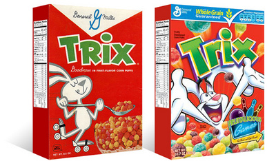
As the post-modern fever begins to quiet in America, designers are seeming to look back at quieter, more restrained design. For this blog we will look at the redesign of the trix cereal box.
On the left is the current design [D1] of Trix cereal, a throwback to a simpler time. And on the left the second most recent design [D2] of Trix cereal.
Looking at the D2 design, there is less unity with the entire box and more emphasis on the brand 'Trix'. The pieces are all seemingly disparate, only unified by the usage of similar colors.The illustration is loud, and unrestrained, typical of post-modern design--lots of noise, loud, and a disregard to traditional design standards.
Now looking at the D1 design, the box is unified as a whole, the panels flow from one to another without a 'pause' in its reading. The emphasis is now the whole of the box rather than the brand. The design is much quieter and easier to read.
Hopefully with this new sense of design, there will be less bad design and more great design.
Thanks to TheDieline.com for the image.
Subscribe to:
Posts (Atom)