As the post-modern fever begins to quiet in America, designers are seeming to look back at quieter, more restrained design. For this blog we will look at the redesign of the trix cereal box.
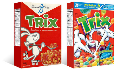
On the left is the current design [D1] of Trix cereal, a throwback to a simpler time. And on the left the second most recent design [D2] of Trix cereal.
Looking at the D2 design, there is less unity with the entire box and more emphasis on the brand 'Trix'. The pieces are all seemingly disparate, only unified by the usage of similar colors.The illustration is loud, and unrestrained, typical of post-modern design--lots of noise, loud, and a disregard to traditional design standards.
Now looking at the D1 design, the box is unified as a whole, the panels flow from one to another without a 'pause' in its reading. The emphasis is now the whole of the box rather than the brand. The design is much quieter and easier to read.
Hopefully with this new sense of design, there will be less bad design and more great design.
Thanks to TheDieline.com for the image.
No comments:
Post a Comment