Wednesday, November 18, 2009

Vibrating boundaries


Josef Albers discusses the Interaction of Color and how it is perceived by humans. His book utilizes paper diagrams to help emphasize theory. The basic theory of 'Vibrating Boundaries' is when complementary colors are placed on top of each other they tend to 'vibrate'. This is because the colors help emphasize each other.

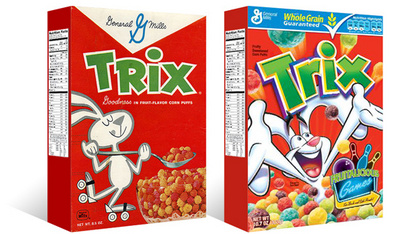
As you can see by the example to the right, the cyan text and the objects seem as though they are popping out of the red field.

This theory can be used in a quick design where attention is needed to be drawn. The harshness of complementary colors applied on top of each other naturally draws the eye to it. However, as a designer we must be aware of this and avoid it as it is not necessarily the best tool to gain attention.

Sunday, November 1, 2009

Escher


M.C. Escher

We have all seen the works of M.C. Escher. Whether it be in a classroom or a book, you have to appreciate the ability for Escher to play with the figure/ground to create shapes and images. The seemingly unstable image should been seen as a bistable image, that can reflect both a set of black birds and a set of white birds.

Escher has an ability for creating illusions of space. Are the birds black or are they white? A seemingly novel trick, this ability is useful for many graphic artist and designers today. Understanding the properties of Gestalt, is like learning to use your hands to draw.

Even if you did not understand the properties of Gestalt, you probably know them without even knowing it. We use them everyday as designers and artists.


Image courtesy of http://www.clas.ufl.edu/ipsa/journal/2000_tsur03.shtml

Simple Designs


1" Grid Design.

As a designer, there are basic projects we all must do. This 1"grid design was one of those I had to do. Initially the design was in black and white, but for another project I added the color. Here there is a great deal of rhythm, pattern, shape and line. The smaller shapes unify to create bigger shapes. There seems to be an unstable relationship with the colors and shapes. The purple seems to come forward in the mush of red and yellow, but at the same time the red and yellow are fighting to come to the foreground. There is even a sense of good continuation with some of the sphere shapes.


Even with the simplest of projects, the outcome can be very complex.

Annie's Blue Jeans


Annie's Blue Jeans

79" x 82"

Made from Annie Ruth Collin's old blue jeans tapestry fabric, cotton fabric, cotton velvet, hand dyed wide-wale cotton corduroy, cotton batting and muslin.

Hand quilted by Mensie Pettway of Gee Bend Alabama.

Looking at 'Annie's Blue Jeans' quilt, the usage of line, shape, value, and some rhythm are apparent. Initially, the inner square holds a sense of balance and scale. Each square within this inner square is a solid color which makes it stand out from the shades of blue. The inner square becomes a sort of focal point for the viewer.

Pettway makes good use of line and repetition. There is some rhythm to the entire peace, as each 'ring' of the quilt flows from one to the other, there are no abrupt stops. Shades of blue leading to the climax, the inner square.

The texture reflects the materials used--Blue Jeans.

Pettway takes an age old tradition of quilt making, and brings it back to its roots in a time where quilts are typically made from bought fabrics, not old unused clothing, fabric and other things.

If you would like to see the full gallery of quilt collections, and you are in the Davis, CA area, head over to the Nelson Art Gallery located in UC Davis.


Monday, October 26, 2009

Yeoman Organics

Today I will be featuring an organic T-shirt company with roots in the Davis community and the Bay area. The owner, Joe, started the company in 2008 with two other individuals, Phil and Levy. Yeoman Organics is commited to 'clean design' and 'bridging the gap between design and organics'.

They utilise clean, or green, techniques of printmaking and organic cotton shirts. This helps the local cotton farmers, and helps to reduce 1/3 pounds of pesticides per shirt.

For more information check out:
www.yeomanorganics.com

Yeoman Organics on Facebook

Sunday, October 25, 2009

'Love Makes Many...' by Neochron


Love makes many things seem insignificant is an amazing piece of typography. Neochron, of the DevianArt community, makes good use of negative positive space with the lettering as well as the silhouetted figures and structures that are scattered within the main body of text.

The main text is well balanced with negative and positive space. The cityscape and bridge offset the floral design at the top of the text. The figure cutting into the 'M' appears to be coming from behind the 'A', creating a focal point, as, I suppose, most people associate love with another human being.

The emphasis on 'Love Makes Many' helps to convey the message 'Love makes many things seem insignificant'. Add to this, the 'things seem insignificant' is comparably smaller in size also helps to convey the message behind this poster.

The usage of familiar symbols help the reader or viewer to relate to the poster. The heart symbol, and even the color red we associate with love and romance. Also, the red/black color scheme is a classic color scheme that always goes well together.

All together, this typography piece is well done and well thought out. It get its message accross in a somewhat 'cute' and 'playful' way.

Image courtesy of Neochron at DeviantArt.com

Designing for the 21st century


As the post-modern fever begins to quiet in America, designers are seeming to look back at quieter, more restrained design. For this blog we will look at the redesign of the trix cereal box.

On the left is the current design [D1] of Trix cereal, a throwback to a simpler time. And on the left the second most recent design [D2] of Trix cereal.

Looking at the D2 design, there is less unity with the entire box and more emphasis on the brand 'Trix'. The pieces are all seemingly disparate, only unified by the usage of similar colors.The illustration is loud, and unrestrained, typical of post-modern design--lots of noise, loud, and a disregard to traditional design standards.

Now looking at the D1 design, the box is unified as a whole, the panels flow from one to another without a 'pause' in its reading. The emphasis is now the whole of the box rather than the brand. The design is much quieter and easier to read.

Hopefully with this new sense of design, there will be less bad design and more great design.

Thanks to TheDieline.com for the image.